
How to simulate scenarios with Power BI’s what-if parameter?
In this post, I’ll walk you through how to use Power BI’s what-if parameter to run simulations, thus turning your dashboard from a static report into an interactive decision-support tool.
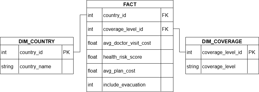
The Dataset
This project uses a synthetic star schema dataset, generated with Python. It mimics real-world country-level healthcare and insurance stats across Asia. You’ll find the Python script as well as the entire dataset on my GitHub. Here is a simplified data model diagram to show the structure.
The Goal
We will estimate the monthly insurance plan cost based on:
- User-selected destination country
- User-selected risk tolerance level
- Whether evacuation coverage is included
In short, the dashboard will update the cost dynamically to reflect how risk-averse or risk-seeking a traveler is.
The How-To
Step 1: Create the what-if parameter
In Power BI, go to Modeling → New Parameter → Numeric Range. Define the parameter as shown below. I unchecked the “Add slicer to this page” because I want to use the list slicer instead of the default slicer visual.

This creates a new table called Risk Tolerance Level with:
- a column named
Risk Tolerance Level - a measure named
Risk Tolerance Level Value.
Step 2: Add a list slicer for risk tolerance level
In the Risk Tolerance Level table, create a new column risk_tolerance_level_display by using the DAX code below.
risk_tolerance_level_display = SWITCH(
'Risk Tolerance Level'[Risk Tolerance Level Value],
1, "1-Low",
2, "2-Medium",
3, "3-High")
Add the list slicer with this new column as its Field. This makes the definition of our what-if parameter clear to the user. A lower number corresponds to a lower risk tolerance level, meaning the traveler is more risk averse. A higher number corresponds to a higher risk tolerance level, meaning the traveler is more risk loving.
Step 3: Create the cost estimator measure
Create a measure in the Risk Tolerance Level table by using the DAX code below.
estimated_plan_cost =VAR risk_sensitivity_multiplier =SWITCH( SELECTEDVALUE('Risk Tolerance Level'[Risk Tolerance Level]), 1, 0.15, -- low tolerance → higher premium for risk 2, 0.10, 3, 0.05 -- high tolerance → willing to accept risk)VAR risk_adjustment_factor = 1 + (SELECTEDVALUE('fact'[normalized_total_risk_score]) * risk_sensitivity_multiplier)VAR evacuation_multiplier = IF(SELECTEDVALUE('fact'[include_evacuation])=1, 1.2, 1.0)VAR plan_cost_estimate = SELECTEDVALUE('fact'[avg_plan_monthly_cost]) * risk_adjustment_factor * evacuation_multiplierRETURN IF( ISFILTERED('Risk Tolerance Level'[risk_tolerance_level_display]), IF(plan_cost_estimate, plan_cost_estimate, "Select Country"), "Select Country & Tolerance Level")As you can see, we use the country-specific average plan cost already in our dataset as the base cost. Then we adjust it according to the selected risk tolerance level, as well as the country's total risk score and the inclusion of evacuation.
Step 4: Create the visual for estimated plan cost
Add the estimated_plan_cost measure to a card visual. There you have it, it’s done! The estimated cost goes up as the risk tolerance level decreases.


Bonus: Make other visuals react to risk tolerance
You might have noticed that the scatterplot in the first screenshot has all the countries plotted. But after we used the slicers, there is only 1 dot left on the second screenshot and none left on the last screenshot.
This is because all 3 slicers on the right were applied to the scatterplot. Philippines’ health risk score only meets the high risk tolerance level, which is why the dot disappeared as our risk tolerance level dropped to medium.
Power BI adds the first two slicers to the scatterplot automatically thanks to the data model we built. However, we need to add the what-if parameter filter to the plot on our own. Here’s how to do it:
Step 1: Create a maximum risk threshold
Use the DAX code below to create a max_accept_risk measure. This translates the 3 risk tolerance levels to their corresponding numeric thresholds (you can define any way you want).
max_accept_risk =SWITCH( SELECTEDVALUE('Risk Tolerance Level'[Risk Tolerance Level]), 1, 1.0, -- Low Tolerance 2, 1.8, -- Medium Tolerance 3, 3.0 -- High Tolerance)Step 2: Create a boolean flag
Use the DAX code below to create a within_tolerance measure in the fact table. This measure identifies if a country’s health risk score is above the selected tolerance level or not (1 - Yes, 0 - No). We use the max_accept_tolerance here because that's the actual numeric threshold.
within_tolerance = IF( ISFILTERED('Risk Tolerance Level'[risk_tolerance_level_display]), IF(SELECTEDVALUE('fact'[normalized_total_risk_score])<=[max_accept_risk], 1, 0), 1)Step 3: Add a filter to the scatterplot
Add a within_tolerance filter to the scatterplot as the following:

Once this filter is applied, the scatterplot dynamically responds as the user adjusts the risk tolerance level, showing only countries they would realistically consider.
Try It Yourself
The full project is available on my GitHub. Feel free to explore the .pbix file and Python synthetic data generator.